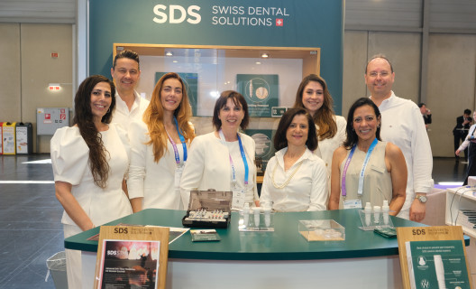
For more than three decades, the company’s previous logo appeared across OEMUS MEDIA AG’s magazines, congresses, websites, newsletters and trade show displays. During that time, the company continued to evolve. What began as a traditional specialist publishing house has long since become an integrated media company, with its Print, Online, Event, Study and Corporate divisions working together to shape communication within the dental industry. The new brand identity brings this evolution to life visually.
A smile at the core of the brand
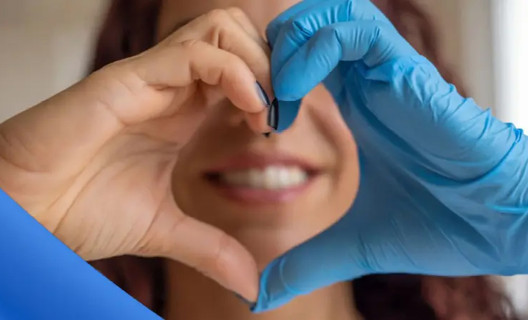
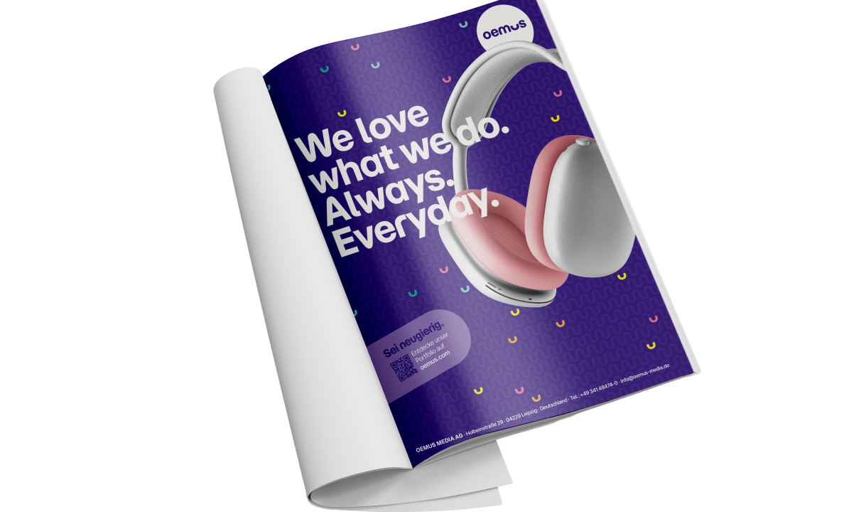
At the heart of the new identity is “oemus”—lowercase, pared back and focused. Its defining feature, the redesigned “u,” evokes a smile and reflects the company’s dental roots. It also stands for “you,” “us” and “we,” symbolising the community and collaboration that have long shaped OEMUS MEDIA AG: #welovewhatwedo.
The new colour palette pairs Deep Viola—combining professionalism and creativity—with a modular system that gives each business division its own secondary colour. This creates clear visual structure while maintaining a cohesive identity.
The distinctive “u” also forms a brand pattern used across magazines, websites, social media, congresses, newsletters and trade shows. Together, these elements create a comprehensive, instantly recognisable design system.
Modern in appearance, true to our values
The new brand identity builds on everything OEMUS MEDIA AG has stood for over the past three decades: close ties to the market, a passion for dental topics and a strong network connecting people, knowledge and communication. The visual language may be more modern, but the values behind it remain unchanged. They will continue to provide the foundation for everything that defines the OEMUS brand.